Arcade
This virtual gallery app answers the need for viewing artwork in a way that is visually appealing, easy to navigate, and easy to view in many languages.
JUNE 2022 - DECEMBER 2022
The Client:
Portfolio Project for Google UX Design Professional Certificate
The Problem:
Most Virtual Gallery Apps are only allow artwork and information to be viewed in one language.
The Goal:
The Arcade App will let users view artwork online which will affect users that are learning a new language, by allowing the user to learn about the artist in their work in the native language.
My Role:
Lead UX Designer
Responsibilities:
User Research, Wireframing, Prototyping, Visual Design, Team Lead
User Research Summary
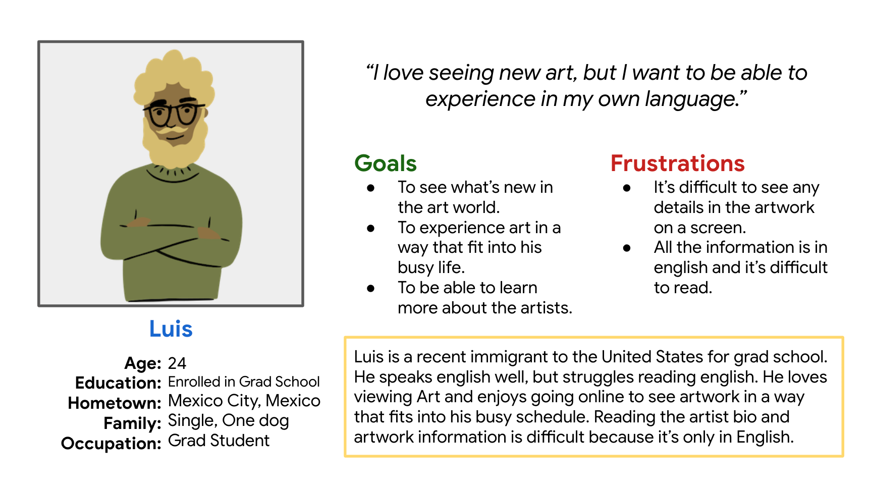
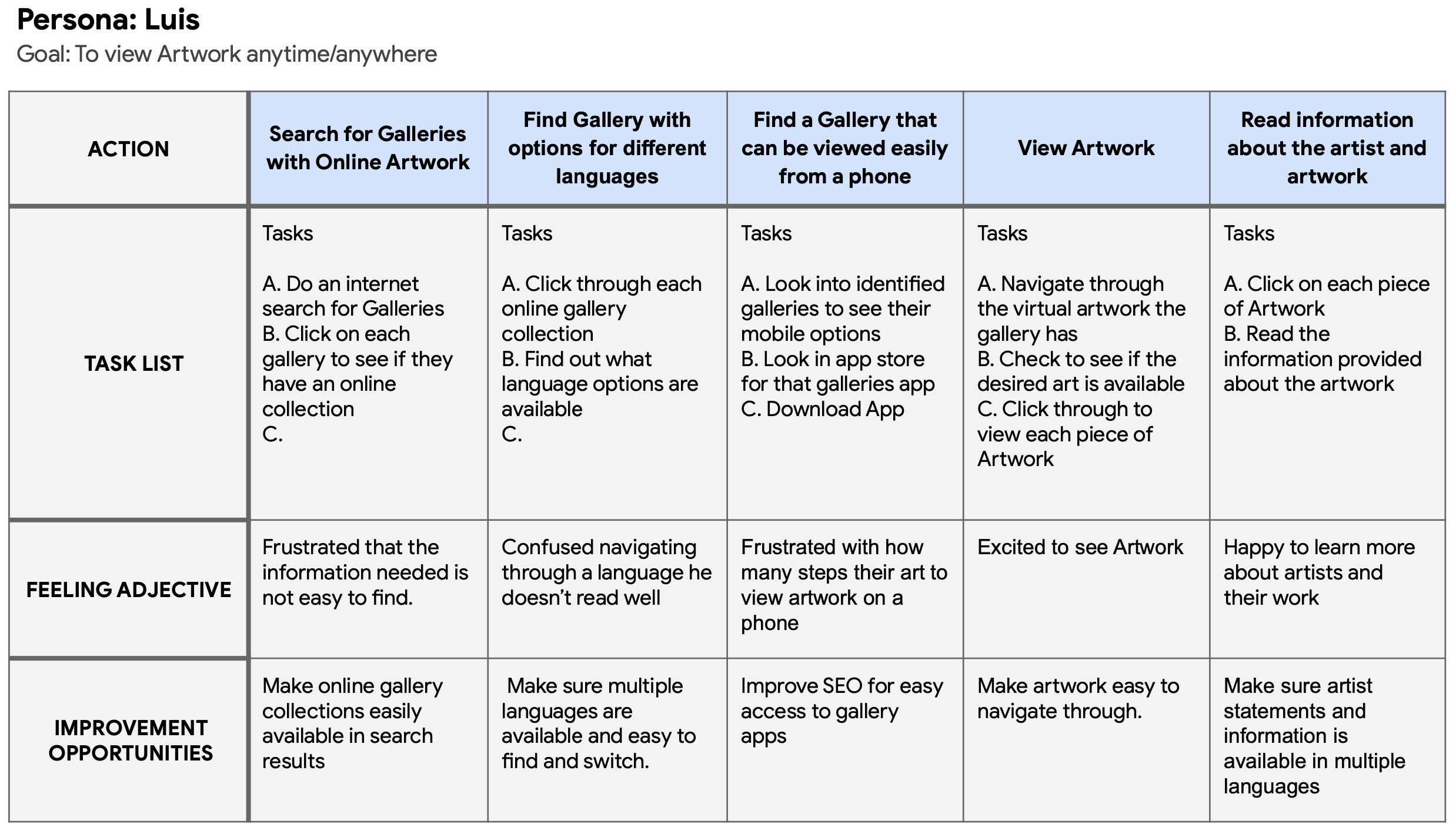
Our research goals were to understand what problems users have with viewing art virtually and what is important to a user to see when viewing art.
I conducted interviews with users to better understand their needs in viewing artwork virtually.
User Pain Points
Time Constraints
Not enjoyable to view artwork online
Not available in their native language
Not able to see descriptions of the artwork easily or at all.
Persona & User Journey
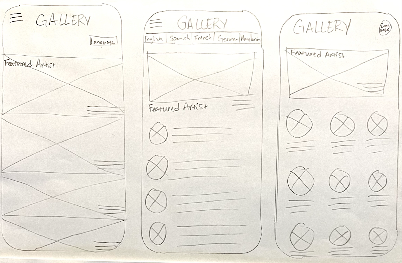
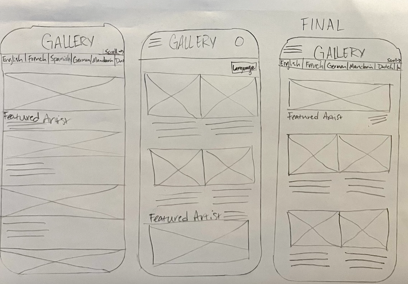
Paper Wireframes
The paper wireframes focused on designing the homepage of the virtual gallery, making sure to include all necessary information in each design.
Digital Wireframes
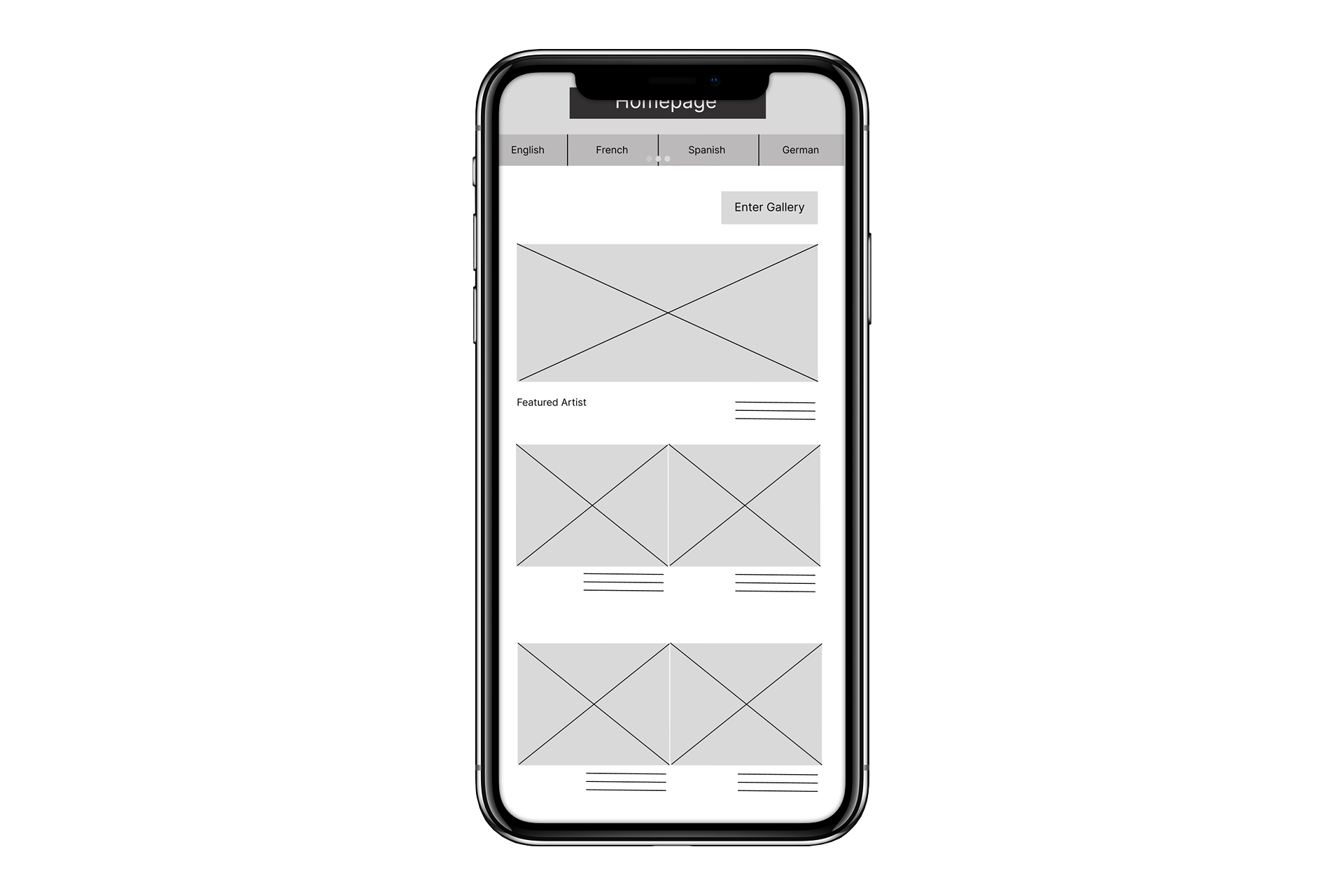
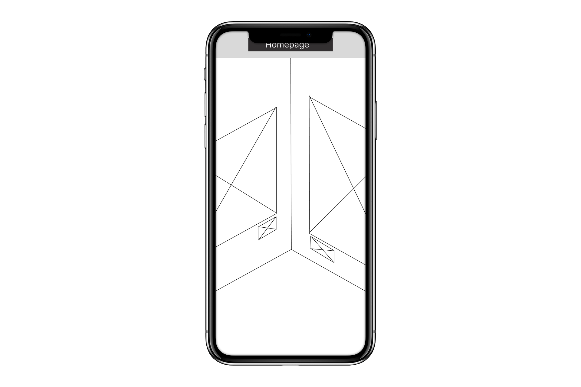
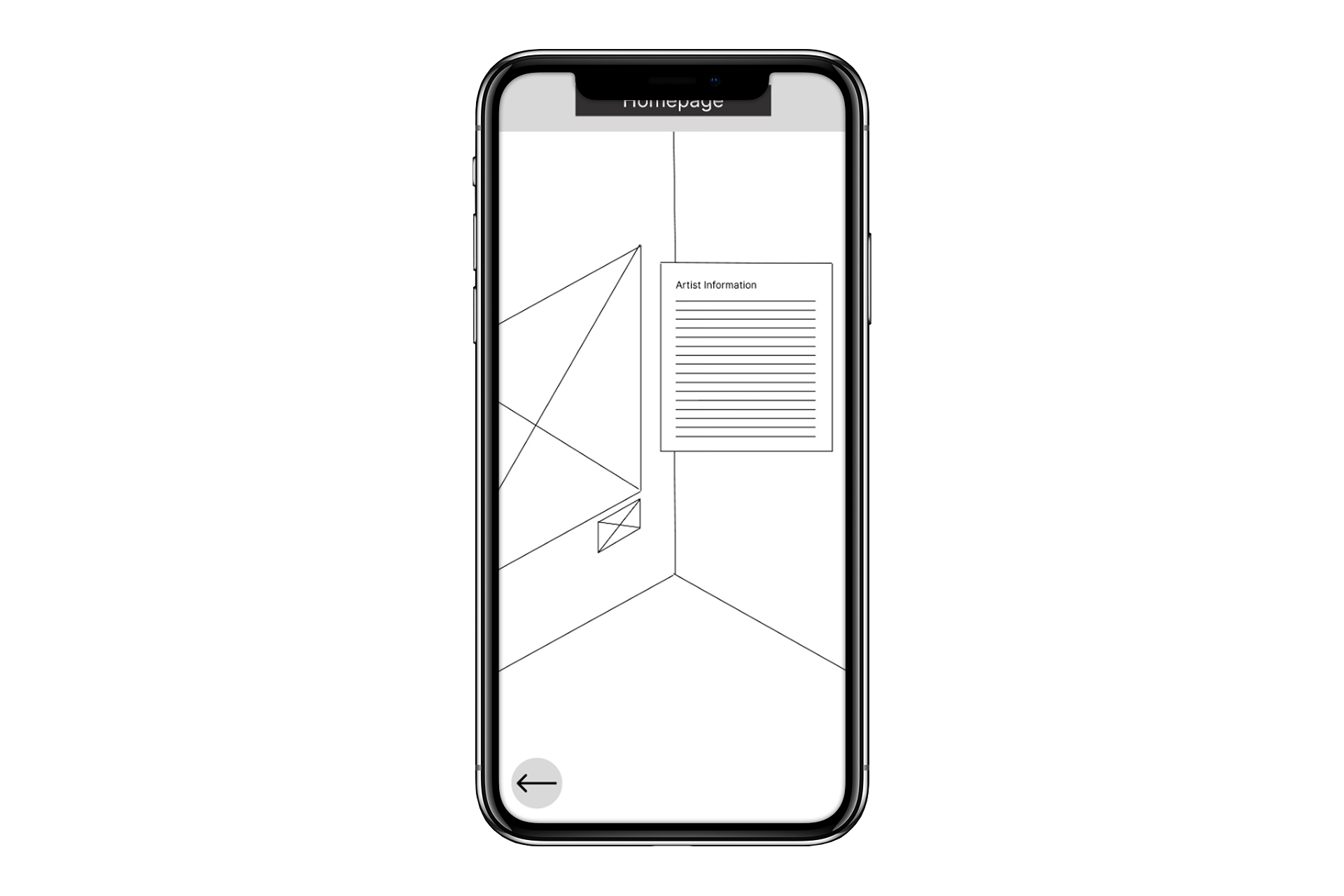
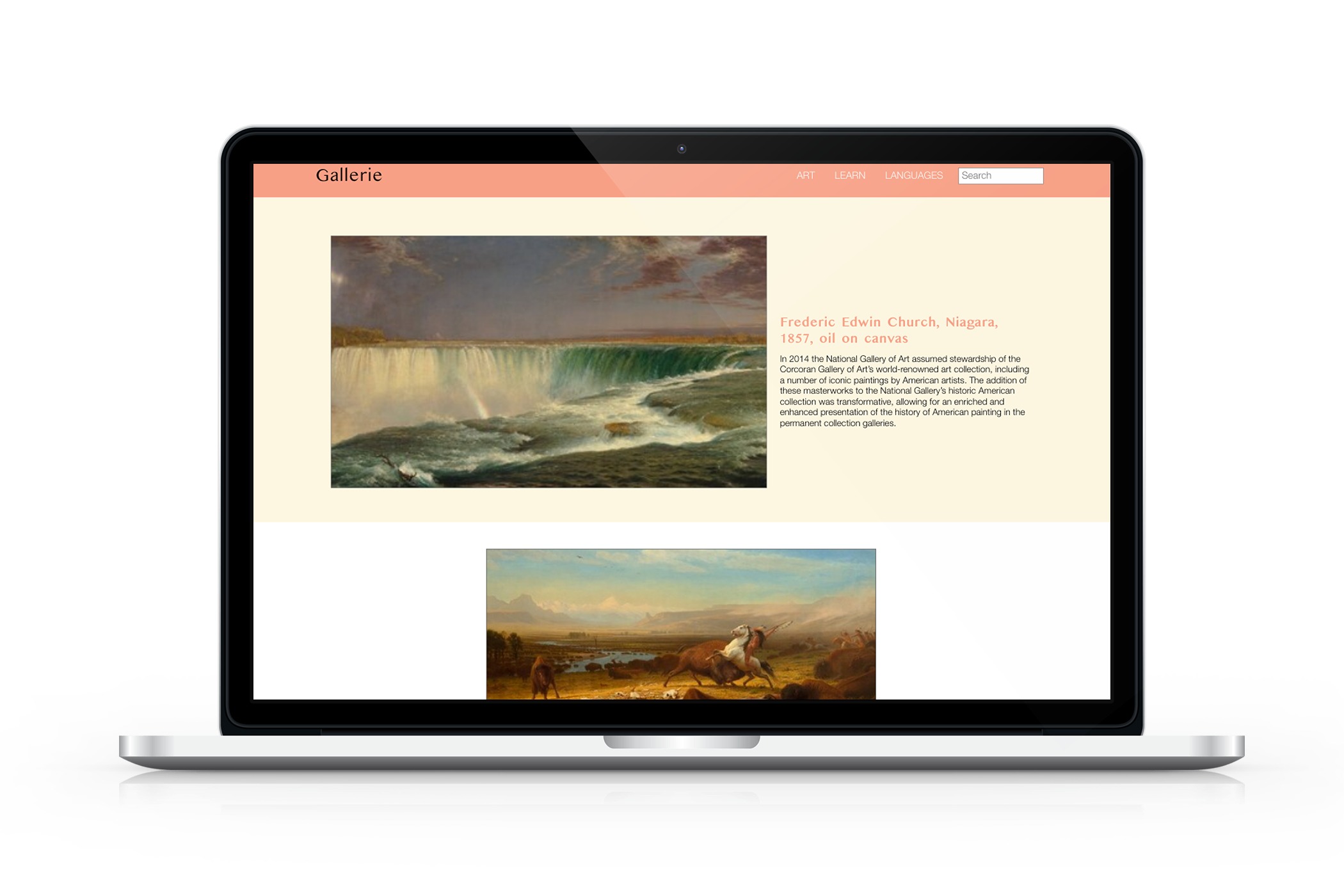
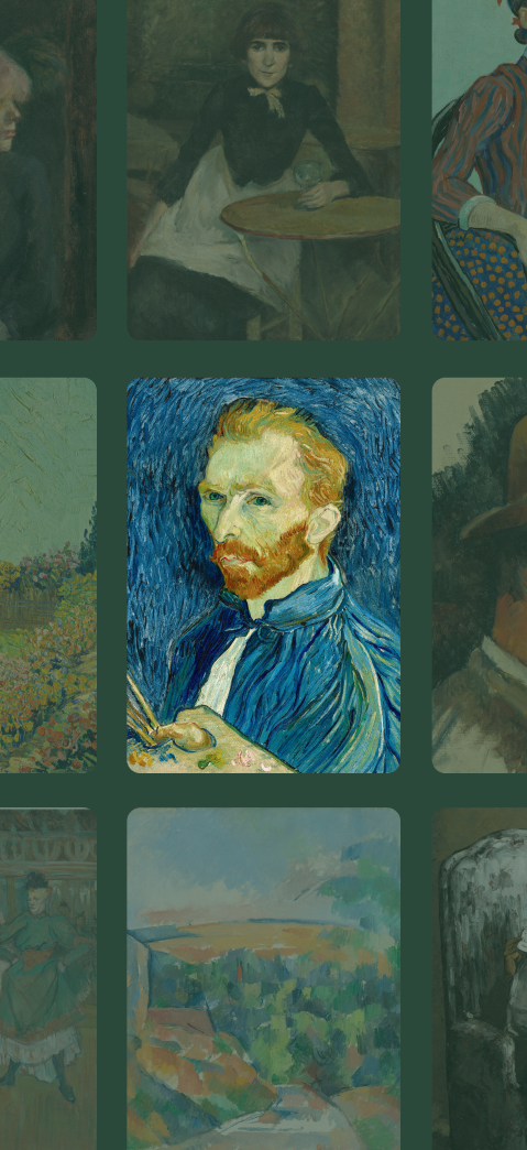
Homepage was designed to easily view images of artwork, see a short snippet of information and change the language.
The gallery was designed to have a view similar to standing inside a gallery.
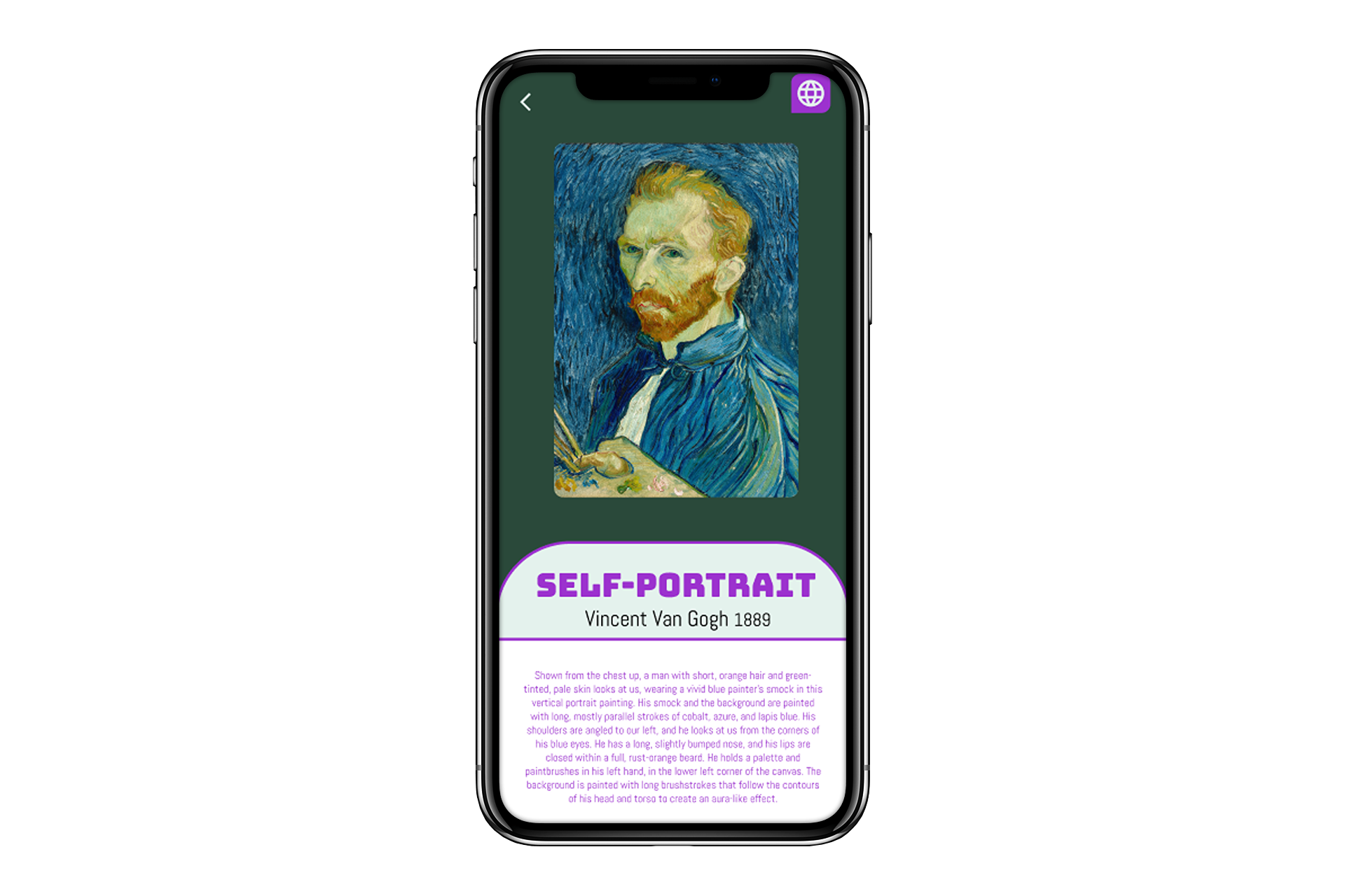
The design was to have a pop up with detailed artist information about each painting.
Usability Study Parameters:
Study Type: Unmoderated Usability Study
Location: USA, Remote
Participants: 5 Participants
Length: 20 minutes
Usability Study Findings:
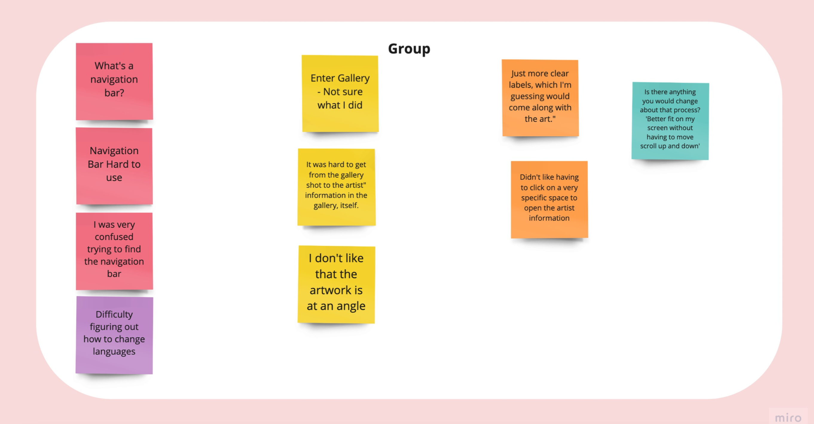
I conducted two rounds of usability studies. Findings from the first study helped guide the designs from wireframes to mockups. The second study used a high-fidelity prototype and revealed what aspects of the mockups needed refining.
Round 1
The navigation bar is not user friendly.
Virtual Gallery Is confusing.
Artist information pop-up is hard to find.
Round 2
Users wanted multiple ways to navigate through the pictures.
Wireframes to Mockups

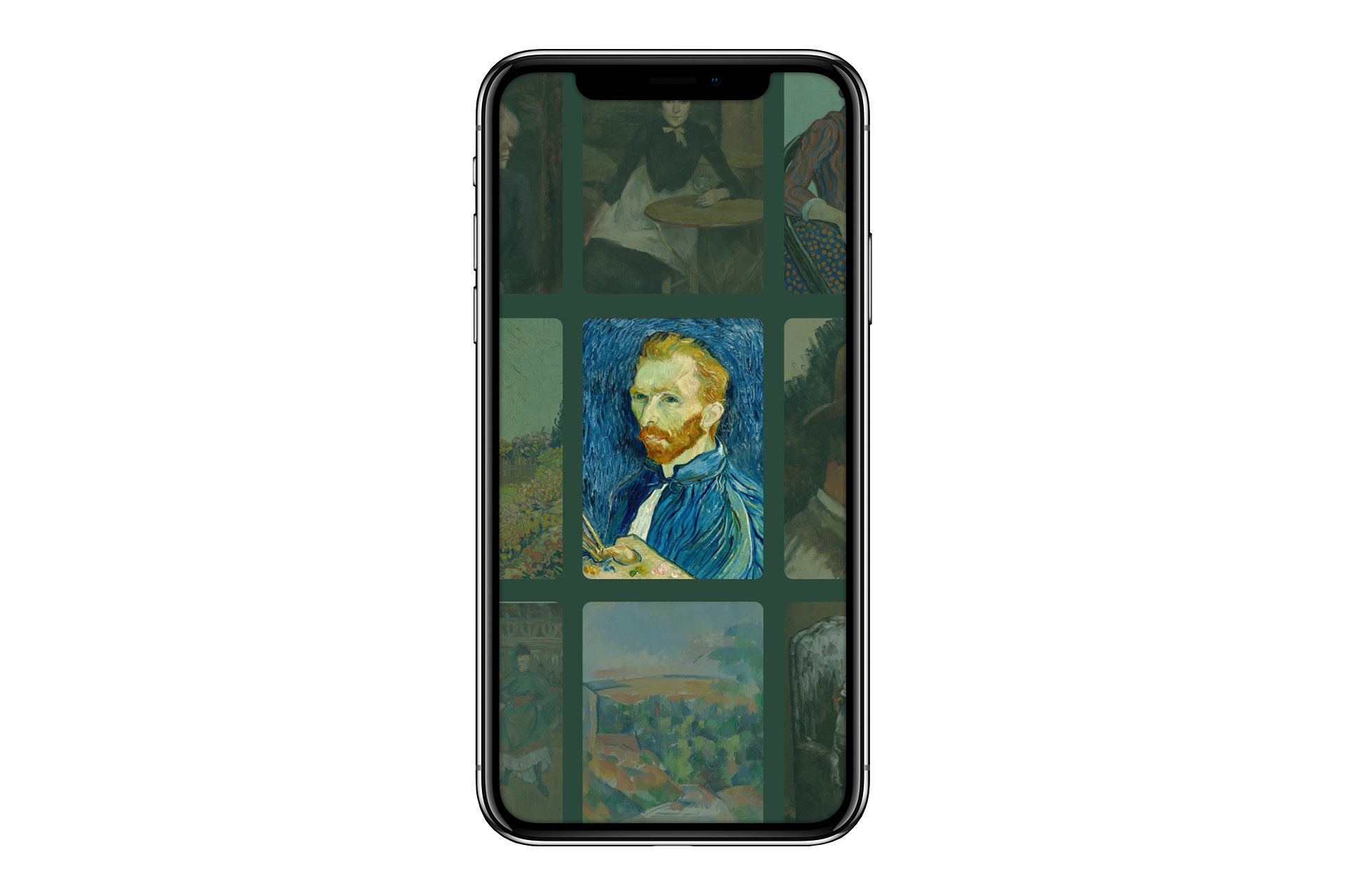
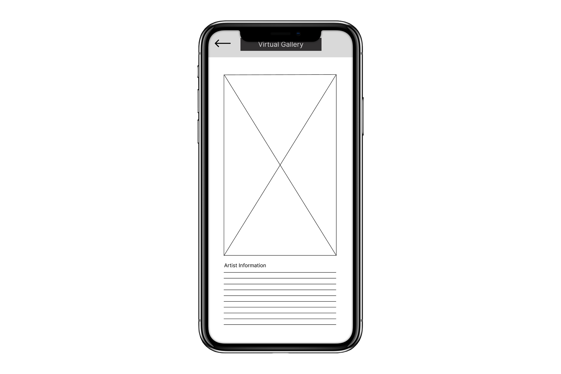

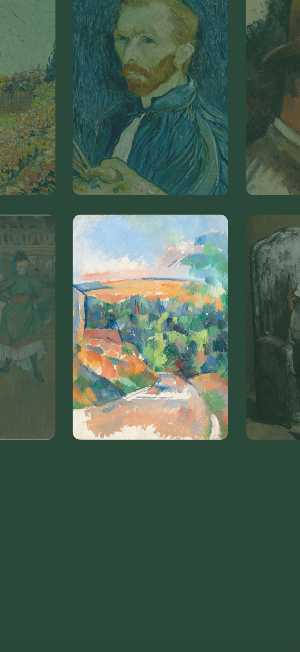
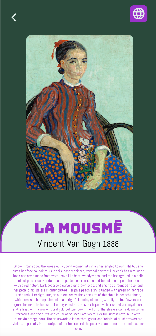
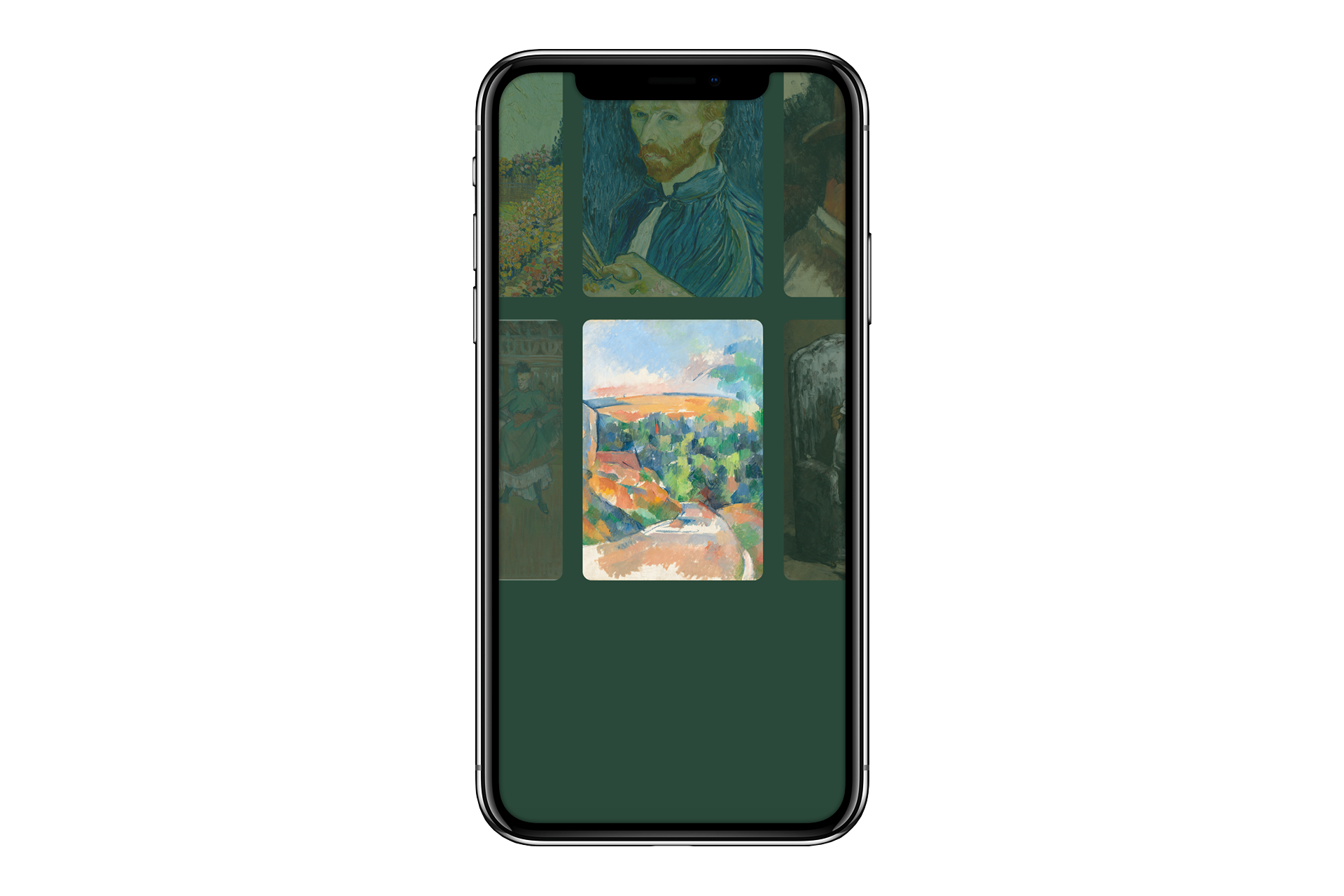
The usability study showed that the navigation bar wasn’t user friendly and it was unclear how to enter the virtual gallery. The design was then simplified to a grid with images to click on.
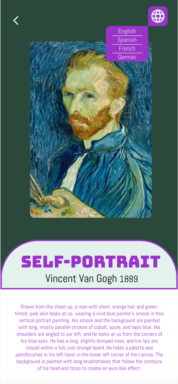
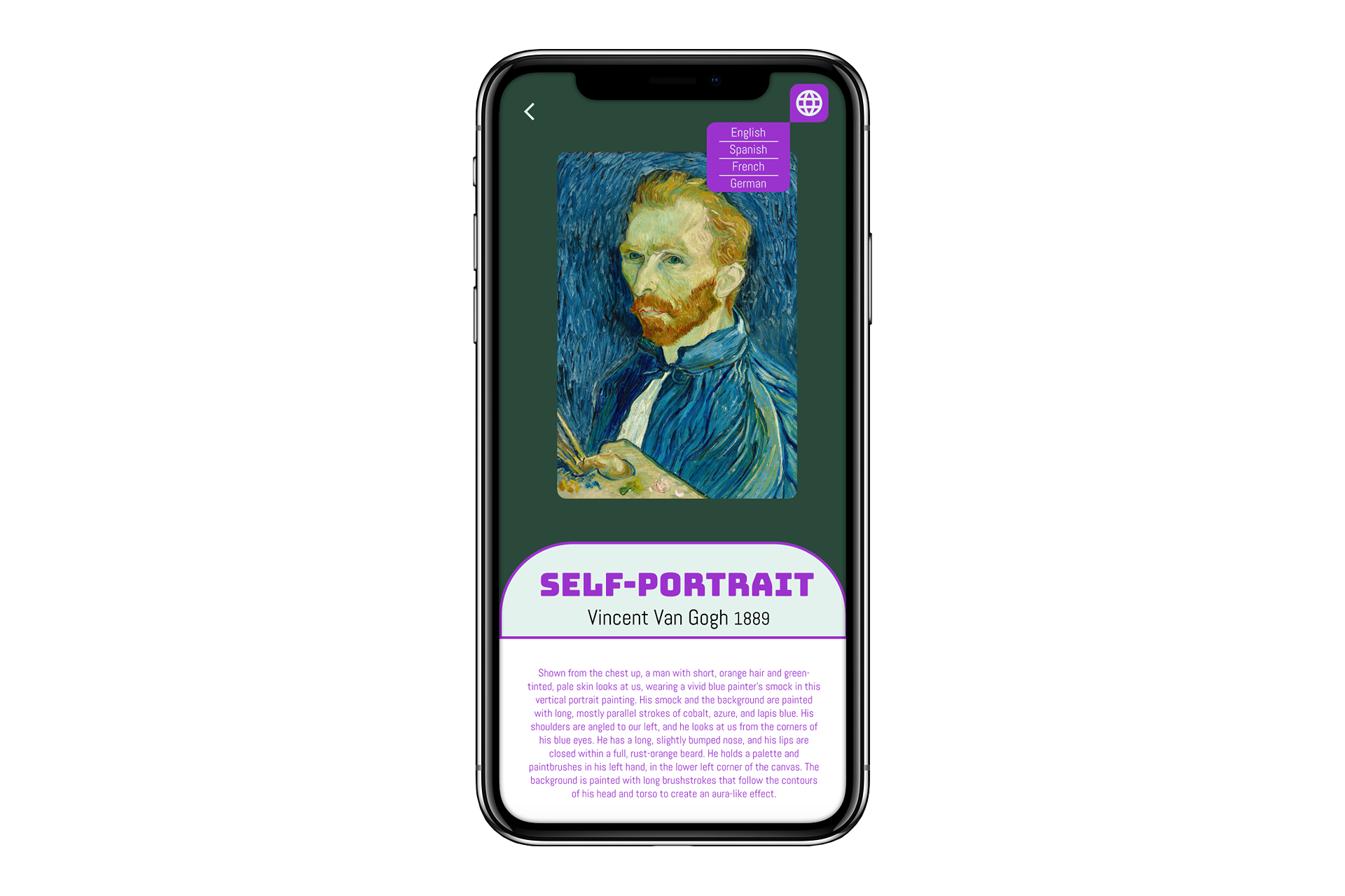
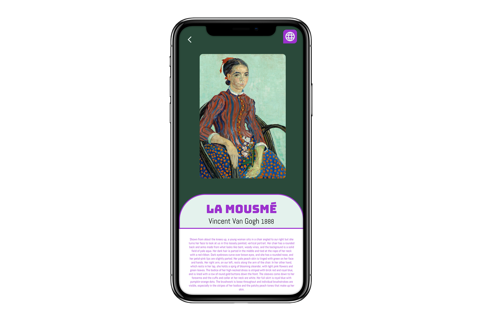
The artist detail pages were designed with detailed information about each painting and an icon to easily switch between languages.
Accessibility Considerations
1
Color Contrast
Color contrast was used to make sure the design is accessible for users with visual impairments.
2
Language Options
Multiple language options are provided so that people from around the world can learn about art in their own language.
3
Font Selection
Fonts were selected to be easy to read and clear. That way they are accessible to those with visual impairments.
What I learned:
Websites make it easy to translate the text into a different language, but virtual gallery apps don't off the same option. Users want to me able to experience information in their own languages. They want an experience that is beautiful, seamless, intuative and one that serves their needs.
I learned how important research and critique are to the design process. When designing on my own, it’s so easy to get focused on one solution to a problem and that's not the best solution. Working with a team is an asset.


Selected Works
